
Power Club is a platform for ambitious and curious learners to explore and make confident career choices.
Power Club is a platform for ambitious and curious learners to explore and make confident career choices.
Power Club is a platform for ambitious and curious learners to explore and make confident career choices.
Power Club is a platform for ambitious and curious learners to explore and make confident career choices.
Power Club is a platform for ambitious and curious learners to explore and make confident career choices.
Power Club is a platform for ambitious and curious learners to explore and make confident career choices.
Power Club is a platform for ambitious and curious learners to explore and make confident career choices.

Reason for the Rebrand
Reason for the Rebrand
As a free app, Uable had a lot of potential, but we were unable to acquire the right target audience. The platform was being used like any other "social media app" and the aspect of learning and exploring was losing importance. As a result, Uable went through a top-to-bottom brand overhaul and ultimately became what it is today, Power Club.
The teens who wanted to be a part of Powerclub, had to go through an application-based process through the website. This allowed us to find passionate and hardworking teens and also better guide them towards their career goals and aspirations.
Reason for the Rebrand
As a free app, Uable had a lot of potential, but we were unable to acquire the right target audience. The platform was being used like any other "social media app" and the aspect of learning and exploring was losing importance. As a result, Uable went through a top-to-bottom brand overhaul and ultimately became what it is today, Power Club.
The teens who wanted to be a part of Powerclub, had to go through an application-based process through the website. This allowed us to find passionate and hardworking teens and also better guide them towards their career goals and aspirations.
As a free app, Uable had a lot of potential, but we were unable to acquire the right target audience.
The platform was being used like any other "social media app" and the aspect of learning and exploring was losing importance. As a result, Uable went through a top-to-bottom brand overhaul and ultimately became what it is today, Power Club.
The teens who wanted to be a part of Powerclub, had to go through an application-based process through the website. This allowed us to find passionate and hardworking teens and also better guide them towards their career goals and aspirations.
Research
I researched multiple websites and social media handles to see how the companies in the same segment were engaging with their audiences.
As well as multiple companies who engage help teenagers with different aspects of their lives.
Researched on the design, that can encapsulate not just teens but also their parents.
Brainstroming
Brainstormed content ideas and concepts with sales and marketing teams. Researched on the ideas and made posts for the socials. Also worked closely with industry mentors to come up with campaign ideas and meets up.
Came up with ways to show the exclusivity of this premium product, to create sort of FOMO in teens.
Execution
Worked closely with developers and UX designers on how to create a safe, engaging website for teens which would be easy to navigate and help understand the complexity of the product.
Also worked on various app communications and assets.
My Approach
I was an integral part of this rebrand and was in charge of handling various B2C communications. Since I was working in Uable for over 2 years and also was a part of its brand guidelines, so was well versed with the type of language and visualization that was needed. We used to go for fun, engaging communications, but now it had to feel ambitious.
Power club now followed Black and White - primary colours, Teal - secondary and Fuschia - accent colour. The visualization and the content shaped in a different direction as well, with a more serious and informative tone. Kanit and a new introduction of Raleway was chosen as the font which best represented the brand.
Research
I researched multiple websites and social media handles to see how the companies in the same segment were engaging with their audiences.
As well as multiple companies who engage help teenagers with different aspects of their lives.
Researched on the design, that can encapsulate not just teens but also their parents.
Brainstroming
Brainstormed content ideas and concepts with sales and marketing teams. Researched on the ideas and made posts for the socials. Also worked closely with industry mentors to come up with campaign ideas and meets up.
Came up with ways to show the exclusivity of this premium product, to create sort of FOMO in teens.
Execution
Worked closely with developers and UX designers on how to create a safe, engaging website for teens which would be easy to navigate and help understand the complexity of the product.
Also worked on various app communications and assets.
As a free app, Uable had a lot of potential, but we were unable to acquire the right target audience.
The platform was being used like any other "social media app" and the aspect of learning and exploring was losing importance. As a result, Uable went through a top-to-bottom brand overhaul and ultimately became what it is today, Power Club.
The teens who wanted to be a part of Powerclub, had to go through an application-based process through the website. This allowed us to find passionate and hardworking teens and also better guide them towards their career goals and aspirations.
Brochure
Reason for the Rebrand
Brochure
Brochure
Reason for the Rebrand
My Approach
I was an integral part of this rebrand and was in charge of handling various B2C communications. Since I was working in Uable for over 2 years and also was a part of its brand guidelines, so was well versed with the type of language and visualization that was needed. We used to go for fun, engaging communications, but now it had to feel ambitious.
Power club now followed Black and White - primary colours, Teal - secondary and Fuschia - accent colour. The visualization and the content shaped in a different direction as well, with a more serious and informative tone. Kanit and a new introduction of Raleway was chosen as the font which best represented the brand.
With the change in target audience, a new design language was created to attract driven teenagers from national and international backgrounds. These brochures were designed with the intent of being distributed in schools and close-knit communities.
I was an integral part of this rebrand and was in charge of handling various B2C communications. Since I was working in Uable for over 2 years and also was a part of its brand guidelines, so was well versed with the type of language and visualization that was needed. We used to go for fun, engaging communications, but now it had to feel ambitious.
Power club now followed Black and White - primary colours, Teal - secondary and Fuschia - accent colour. The visualization and the content shaped in a different direction as well, with a more serious and informative tone. Kanit and a new introduction of Raleway was chosen as the font which best represented the brand.
My Approach
Research
I researched multiple websites and social media handles to see how the companies in the same segment were engaging with their audiences.
As well as multiple companies who engage help teenagers with different aspects of their lives.
Researched on the design, that can encapsulate not just teens but also their parents.
Brainstroming
Brainstormed content ideas and concepts with sales and marketing teams. Researched on the ideas and made posts for the socials. Also worked closely with industry mentors to come up with campaign ideas and meets up.
Came up with ways to show the exclusivity of this premium product, to create sort of FOMO in teens.
Execution
Worked closely with developers and UX designers on how to create a safe, engaging website for teens which would be easy to navigate and help understand the complexity of the product.
Also worked on various app communications and assets.
Brochure
With the change in target audience, a new design language was created to attract driven teenagers from national and international backgrounds. These brochures were designed with the intent of being distributed in schools and close-knit communities.
With the change in target audience, a new design language was created to attract driven teenagers from national and international backgrounds. These brochures were designed with the intent of being distributed in schools and close-knit communities.
With the change in target audience, a new design language was created to attract driven teenagers from national and international backgrounds. These brochures were designed with the intent of being distributed in schools and close-knit communities.
Reason for the Rebrand
With the change in target audience, a new design language was created to attract driven teenagers from national and international backgrounds. These brochures were designed with the intent of being distributed in schools and close-knit communities.
Flyers
App work ——————— Image Manipulation ——————— Tools: Photoshop, Illustrator
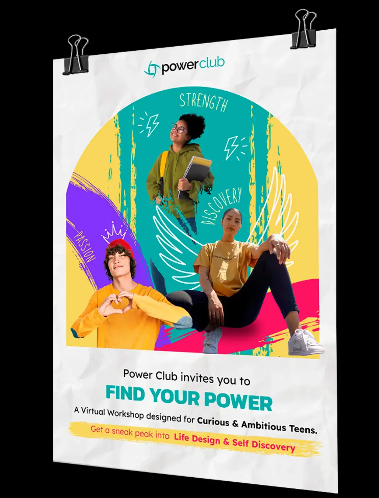
Vibrant and informative flyers were put up in local teenage hotspots like cafes and sports arenas as well as bulletin boards within schools and residential communities.
Brochure
Flyers
Flyers
Flyers
My Approach
I was an integral part of this rebrand and was in charge of handling various B2C communications. Since I was working in Uable for over 2 years and also was a part of its brand guidelines, so was well versed with the type of language and visualization that was needed. We used to go for fun, engaging communications, but now it had to feel ambitious.
Power club now followed Black and White - primary colours, Teal - secondary and Fuschia - accent colour. The visualization and the content shaped in a different direction as well, with a more serious and informative tone. Kanit and a new introduction of Raleway was chosen as the font which best represented the brand.
Brochure ————— Image Manipulation, Iconography, Layouting ————— Tools: Photoshop, XD
Brochure
Brochure ——————————— Image Manipulation, Iconography, layouting ——————————— Tools: Photoshop, XD
With the change in target audience, a new design language was created to attract driven teenagers from national and international backgrounds. These brochures were designed with the intent of being distributed in schools and
close-knit communities.
Website Design — Image Manipulation, Illustration, UI Design — Tools: Photoshop, Illustrator, XD
Flyers ————— Image Manipulation, Illustration, Layouting ————— Tools: Photoshop, Illustrator
Website Design — Image Manipulation, Illustration, UI Design — Tools: Photoshop, Illustrator, XD
Social Media — Image Manipulation, Content Creation —Tools: Photoshop, After Effects, Canva
Brochure ————— Image Manipulation, Iconography, Layouting ————— Tools: Photoshop, XD
Website Design ——— Image Manipulation, Illustration, UI Design ——— Tools: Photoshop, Illustrator, XD
As a free app, Uable had a lot of potential, but we were unable to acquire the right target audience. The platform was being used like any other "social media app" and the aspect of learning and exploring was losing importance. As a result, Uable went through a top-to-bottom brand overhaul and ultimately became what it is today, Power Club.
The teens who wanted to be a part of Powerclub, had to go through an application-based process through the website. This allowed us to find passionate and hardworking teens and also better guide them towards their career goals and aspirations.
As a free app, Uable had a lot of potential, but we were unable to acquire the right target audience. The platform was being used like any other "social media app" and the aspect of learning and exploring was losing importance. As a result, Uable went through a top-to-bottom brand overhaul and ultimately became what it is today, Power Club.
The teens who wanted to be a part of Powerclub, had to go through an application-based process through the website. This allowed us to find passionate and hardworking teens and also better guide them towards their career goals and aspirations.
As a free app, Uable had a lot of potential, but we were unable to acquire the right target audience. The platform was being used like any other "social media app" and the aspect of learning and exploring was losing importance. As a result, Uable went through a top-to-bottom brand overhaul and ultimately became what it is today, Power Club.
The teens who wanted to be a part of Powerclub, had to go through an application-based process through the website. This allowed us to find passionate and hardworking teens and also better guide them towards their career goals and aspirations.
Vibrant and informative flyers were put up in local teenage hotspots like cafes and sports arenas as well as bulletin boards within schools and residential communities.
Vibrant and informative flyers were put up in local teenage hotspots like cafes and sports arenas as well as bulletin boards within schools and residential communities.
Flyers ————— Image Manipulation, Illustration, Layouting ————— Tools: Photoshop, Illustrator
Social Media
Website Design
Social Media
Social Media
Social Media
Social Media
My Approach
Brochure
I was an integral part of this rebrand and was in charge of handling various B2C communications. Since I was working in Uable for over 2 years and also was a part of its brand guidelines, so was well versed with the type of language and visualization that was needed. We used to go for fun, engaging communications, but now it had to feel ambitious.
Power club now followed Black and White - primary colours, Teal - secondary and Fuschia - accent colour. The visualization and the content shaped in a different direction as well, with a more serious and informative tone. Kanit and a new introduction of Raleway was chosen as the font which best represented the brand.
As a free app, Uable had a lot of potential, but we were unable to acquire the right target audience. The platform was being used like any other "social media app" and the aspect of learning and exploring was losing importance. As a result, Uable went through a top-to-bottom brand overhaul and ultimately became what it is today, Power Club.
The teens who wanted to be a part of Powerclub, had to go through an application-based process through the website. This allowed us to find passionate and hardworking teens and also better guide them towards their career goals and aspirations.
Research
Research
I researched multiple websites and social media handles to see how the companies in the same segment were engaging with their audiences.
As well as multiple companies who engage help teenagers with different aspects of their lives.
Researched on the design, that can encapsulate not just teens but also their parents.
I researched multiple websites and social media handles to see how the companies in the same segment were engaging with their audiences.
As well as multiple companies who engage help teenagers with different aspects of their lives.
Researched on the design, that can encapsulate not just teens but also their parents.
I researched multiple websites and social media handles to see how the companies in the same segment were engaging with their audiences.
As well as multiple companies who engage help teenagers with different aspects of their lives.
Researched on the design, that can encapsulate not just teens but also their parents.
Brainstroming
Brainstroming
Brainstormed content ideas and concepts with sales and marketing teams. Researched on the ideas and made posts for the socials. Also worked closely with industry mentors to come up with campaign ideas and meets up.
Came up with ways to show the exclusivity of this premium product, to create sort of FOMO in teens.
Brainstormed content ideas and concepts with sales and marketing teams. Researched on the ideas and made posts for the socials. Also worked closely with industry mentors to come up with campaign ideas and meets up.
Came up with ways to show the exclusivity of this premium product, to create sort of FOMO in teens.
Brainstormed content ideas and concepts with sales and marketing teams. Researched on the ideas and made posts for the socials. Also worked closely with industry mentors to come up with campaign ideas and meets up.
Came up with ways to show the exclusivity of this premium product, to create sort of FOMO in teens.
Execution
Execution
Worked closely with developers and UX designers on how to create a safe, engaging website for teens which would be easy to navigate and help understand the complexity of the product.
Also worked on various app communications and assets.
Worked closely with developers and UX designers on how to create a safe, engaging website for teens which would be easy to navigate and help understand the complexity of the product.
Also worked on various app communications and assets.
Worked closely with developers and UX designers on how to create a safe, engaging website for teens which would be easy to navigate and help understand the complexity of the product.
Also worked on various app communications and assets.
Brochure
My Approach
I was an integral part of this rebrand and was in charge of handling various B2C communications. Since I was working in Uable for over 2 years and also was a part of its brand guidelines, so was well versed with the type of language and visualization that was needed. We used to go for fun, engaging communications, but now it had to feel ambitious.
Power club now followed Black and White - primary colours, Teal - secondary and Fuschia - accent colour. The visualization and the content shaped in a different direction as well, with a more serious and informative tone. Kanit and a new introduction of Raleway was chosen as the font which best represented the brand.
With the change in target audience, a new design language was created to attract driven teenagers from national and international backgrounds. These brochures were designed with the intent of being distributed in schools and close-knit communities.
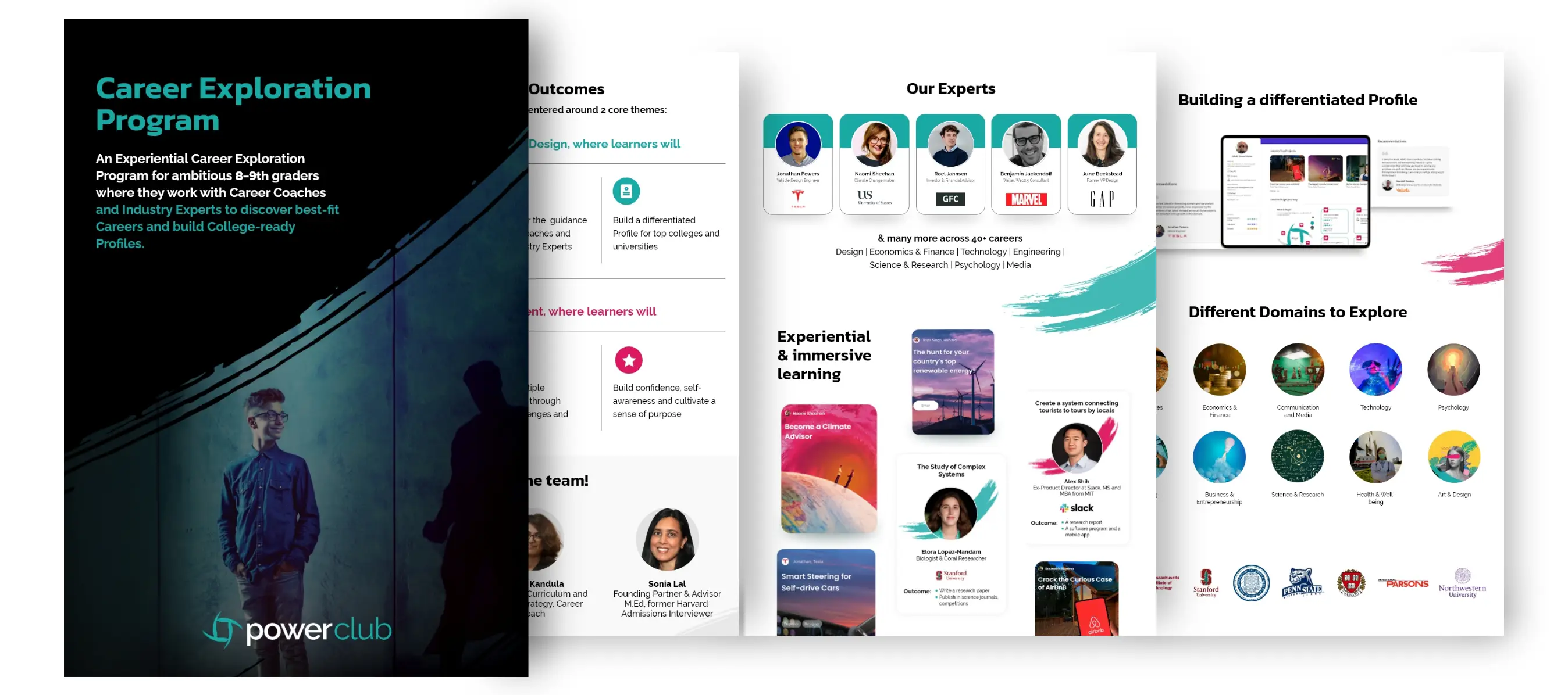
Brochure ——————————— Image Manipulation, Iconography, layouting ——————————— Tools: Photoshop, XD
Brochure ——————————— Image Manipulation, Iconography, Layouting —————————————-Tools: Photoshop, XD
With the change in target audience, a new design language was created to attract driven teenagers from national and international backgrounds. These brochures were designed with the intent of being distributed in schools and close-knit communities.
Flyers
Flyers ——————————— Image Manipulation, illustration, layouting ——————————— Tools: Photoshop, illustrator
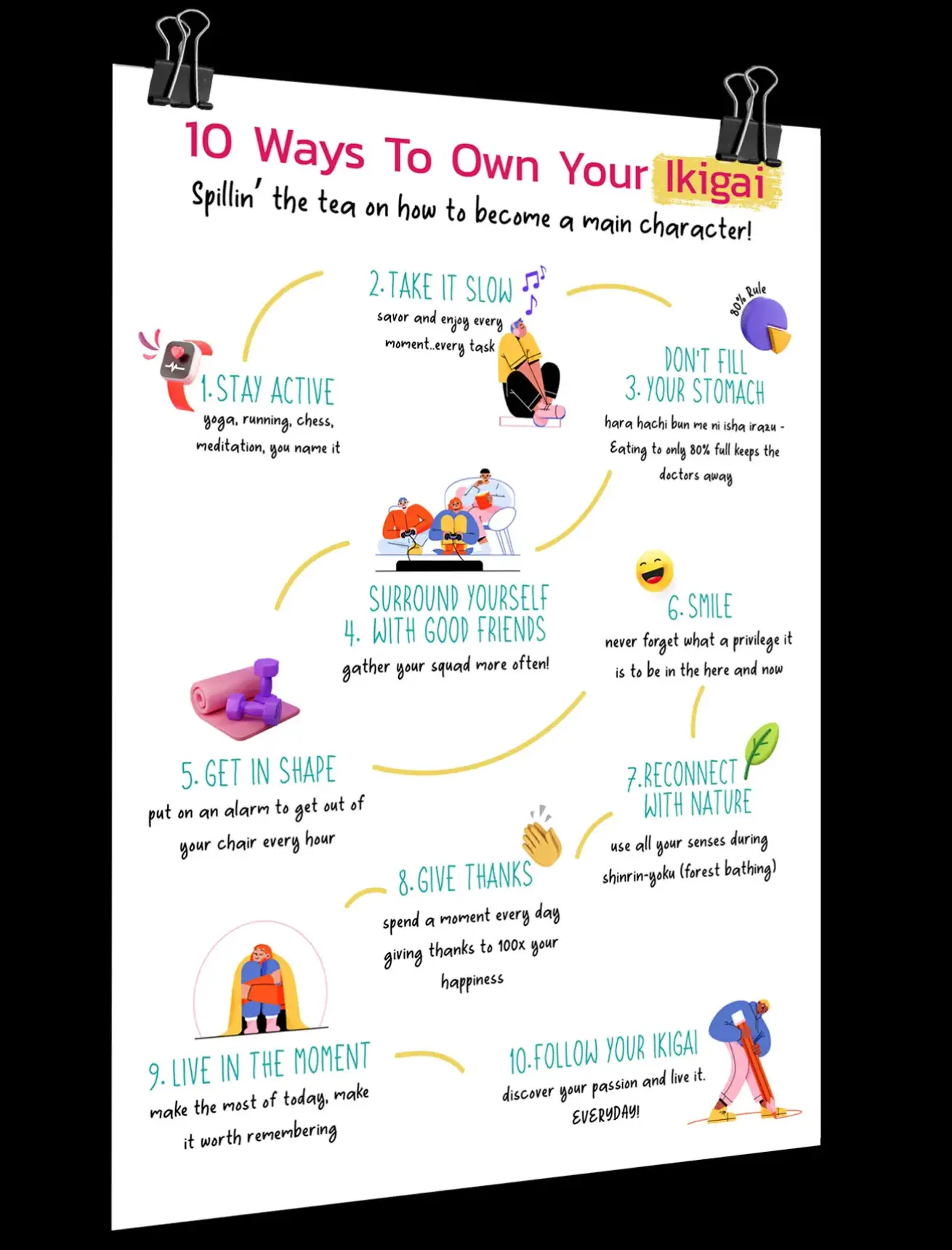
Vibrant and informative flyers were put up in local teenage hotspots like cafes and sports arenas as well as bulletin boards within schools and residential communities.
Brochure ——————————— Image Manipulation, iconography, layouting ——————————— Tools: Photoshop, XD
Website Design ——————— Image Manipulation, Illustration, UI Design ——————— Tools: Photoshop, Illustrator, XD
Flyers
Vibrant and informative flyers were put up in local teenage hotspots like cafes and sports arenas as well as bulletin boards within schools and residential communities.
Vibrant and informative flyers were put up in local teenage hotspots like cafes and sports arenas as well as bulletin boards within schools and residential communities.
Flyers
Social Media
Flyers ——————————— Image Manipulation, Illustration, Layouting ——————————— Tools: Photoshop, Illustrator
Reason for the Rebrand
Website Design

Flyers
Flyers ——————————— Image Manipulation, Illustration, Layouting ——————————— Tools: Photoshop, Illustrator
Flyers ——————————— Image Manipulation, Illustration, layouting ——————————— Tools: Photoshop, Illustrator
Website Design
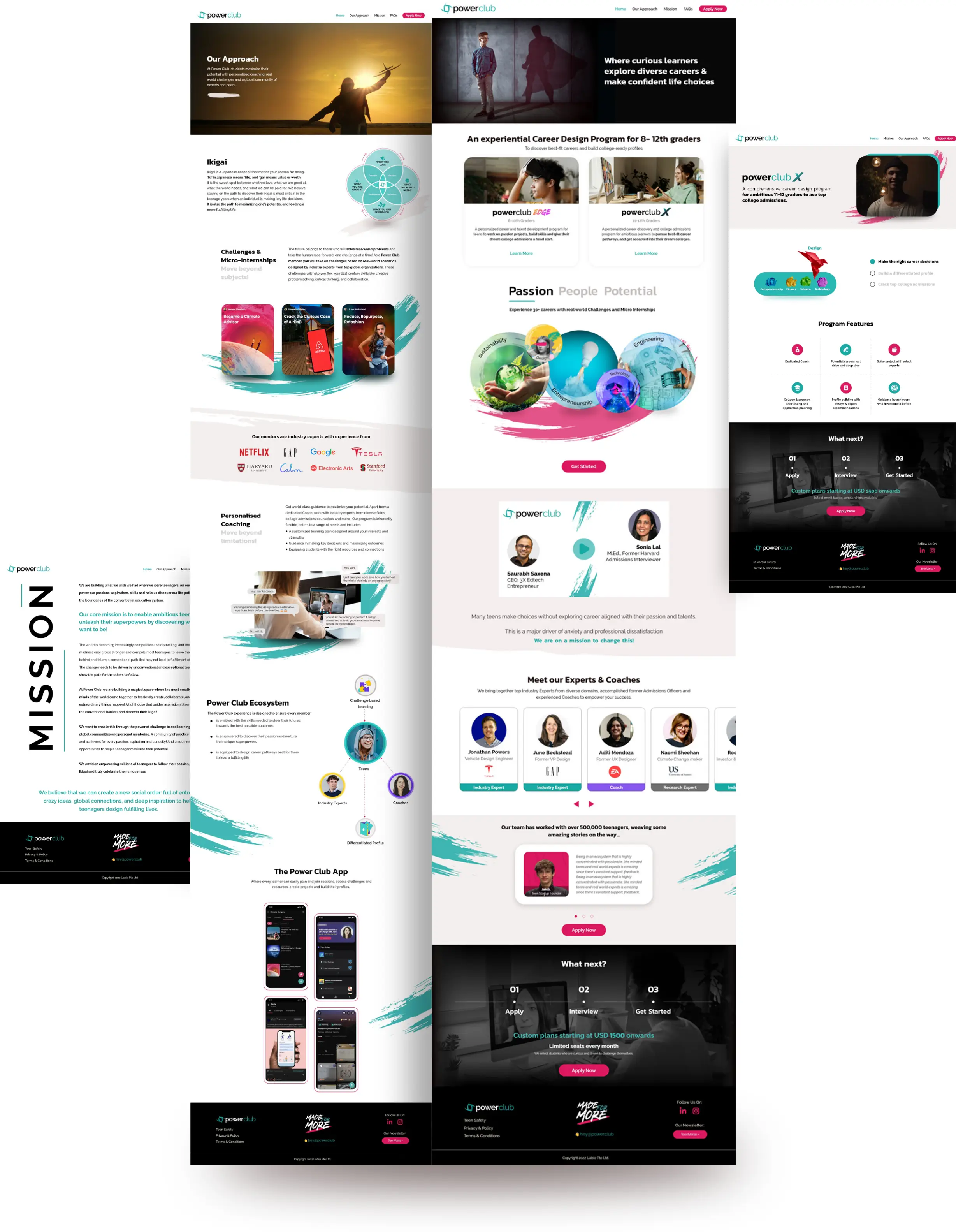
As this product is the first of its kind, effective communication was necessary to attract new clientele in an easy-to-read and easy-to-absorb manner. This was done so that the brand could align with and add value to the goals of said ambitious teenagers.
Flyers ——————————— Image Manipulation, Illustration, Layouting ——————————— Tools: Photoshop, Illustrator
Website Design ——————— Image Manipulation, Illustration, UI Design ——————— Tools: Photoshop, Illustrator, XD
As this product is the first of its kind, effective communication was necessary to attract new clientele in an easy-to-read and easy-to-absorb manner. This was done so that the brand could align with and add value to the goals of said ambitious teenagers.
Brochure ——————————— Image Manipulation, iconography, layouting ——————————— Tools: Photoshop, XD
As this product is the first of its kind, effective communication was necessary to attract new clientele in an easy-to-read and easy-to-absorb manner. This was done so that the brand could align with and add value to the goals of said ambitious teenagers.
Flyers ————— Image Manipulation, Illustration, Layouting ————— Tools: Photoshop, Illustrator
Social Media ——— Image Manipulation, Content Creation ——— Tools: Photoshop, After Effects, Canva
As this product is the first of its kind, effective communication was necessary to attract new clientele in an easy-to-read and easy-to-absorb manner. This was done so that the brand could align with and add value to the goals of said ambitious teenagers.
Social Media ——————— Image Manipulation, Content Creation ——————— Tools: Photoshop, After Effects, Canva
As this product is the first of its kind, effective communication was necessary to attract new clientele in an easy-to-read and easy-to-absorb manner. This was done so that the brand could align with and add value to the goals of said ambitious teenagers.
As this product is the first of its kind, effective communication was necessary to attract new clientele in an easy-to-read and easy-to-absorb manner. This was done so that the brand could align with and add value to the goals of said ambitious teenagers.
Website Design
Website Design
Website Design
Website Design
Website Design
Flyers ——————————— Image Manipulation, illustration, layouting ——————————— Tools: Photoshop, illustrator
Having leveraged research and value-adding content alongside design and animation, I strategically created social media posts to maximize impact to turn average teenagers into Power Teens. These were growth-focused creative posts targeted towards teenagers and their parents, primarily using the company’s Instagram and Linkedin profiles.
Social Media ——————— Image Manipulation, Content Creation ——————— Tools: Photoshop, After Effects, Canva
Having leveraged research and value-adding content alongside design and animation, I strategically created social media posts to maximize impact to turn average teenagers into Power Teens. These were growth-focused creative posts targeted towards teenagers and their parents, primarily using the company’s Instagram and Linkedin profiles.
Having leveraged research and value-adding content alongside design and animation, I strategically created social media posts to maximize impact to turn average teenagers into Power Teens. These were growth-focused creative posts targeted towards teenagers and their parents, primarily using the company’s Instagram and Linkedin profiles.
Having leveraged research and value-adding content alongside design and animation, I strategically created social media posts to maximize impact to turn average teenagers into Power Teens. These were growth-focused creative posts targeted towards teenagers and their parents, primarily using the company’s Instagram and Linkedin profiles.


Having leveraged research and value-adding content alongside design and animation, I strategically created social media posts to maximize impact to turn average teenagers into Power Teens. These were growth-focused creative posts targeted towards teenagers and their parents, primarily using the company’s Instagram and Linkedin profiles.
Connect with me on:
Connect with me on:
Website Design
Connect with me on:
Connect with me on:
Website Design ——————— Image Manipulation, Illustration, UI Design ——————— Tools: Photoshop, Illustrator, XD
Social Media
Having leveraged research and value-adding content alongside design and animation, I strategically created social media posts to maximize impact to turn average teenagers into Power Teens. These were growth-focused creative posts targeted towards teenagers and their parents, primarily using the company’s Instagram and Linkedin profiles.
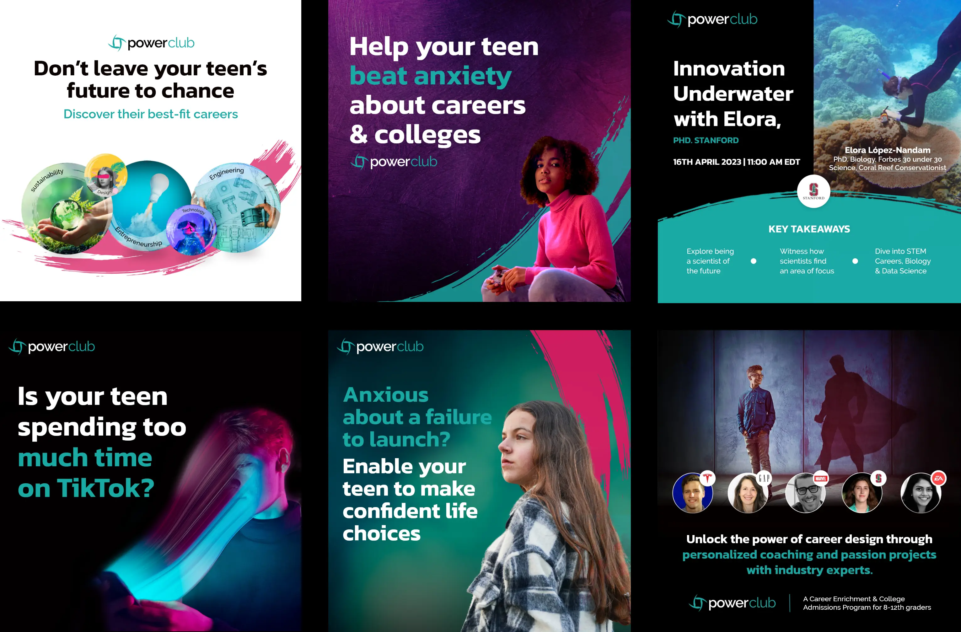
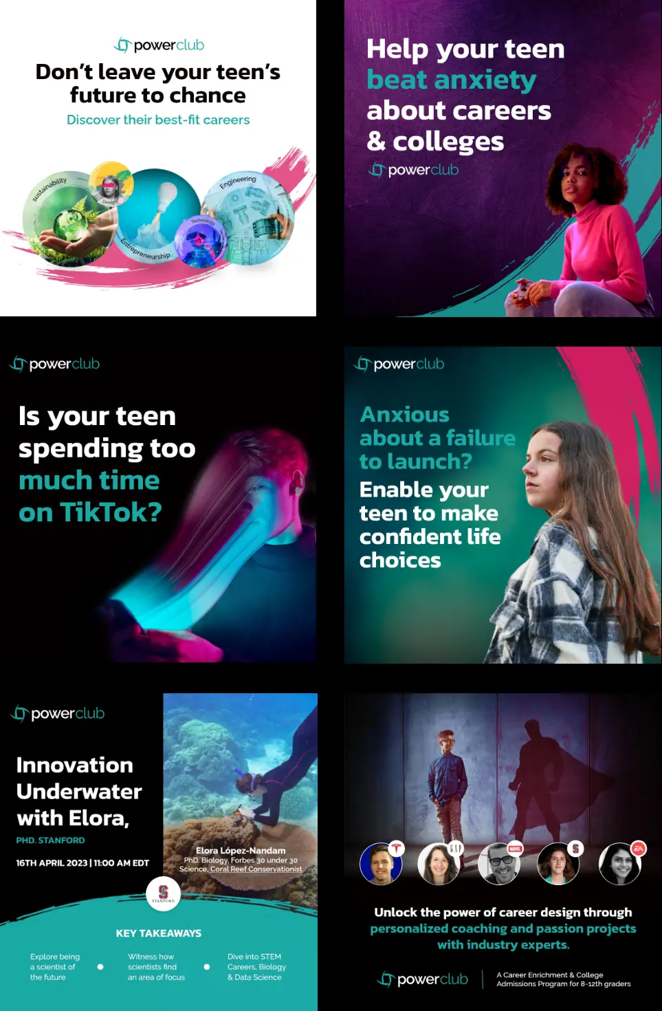


Social Media ——————— Image Manipulation, Content Creation ——————— Tools: Photoshop, After Effects, Canva
Connect with me on: